Swartland Re-brand


About This Project
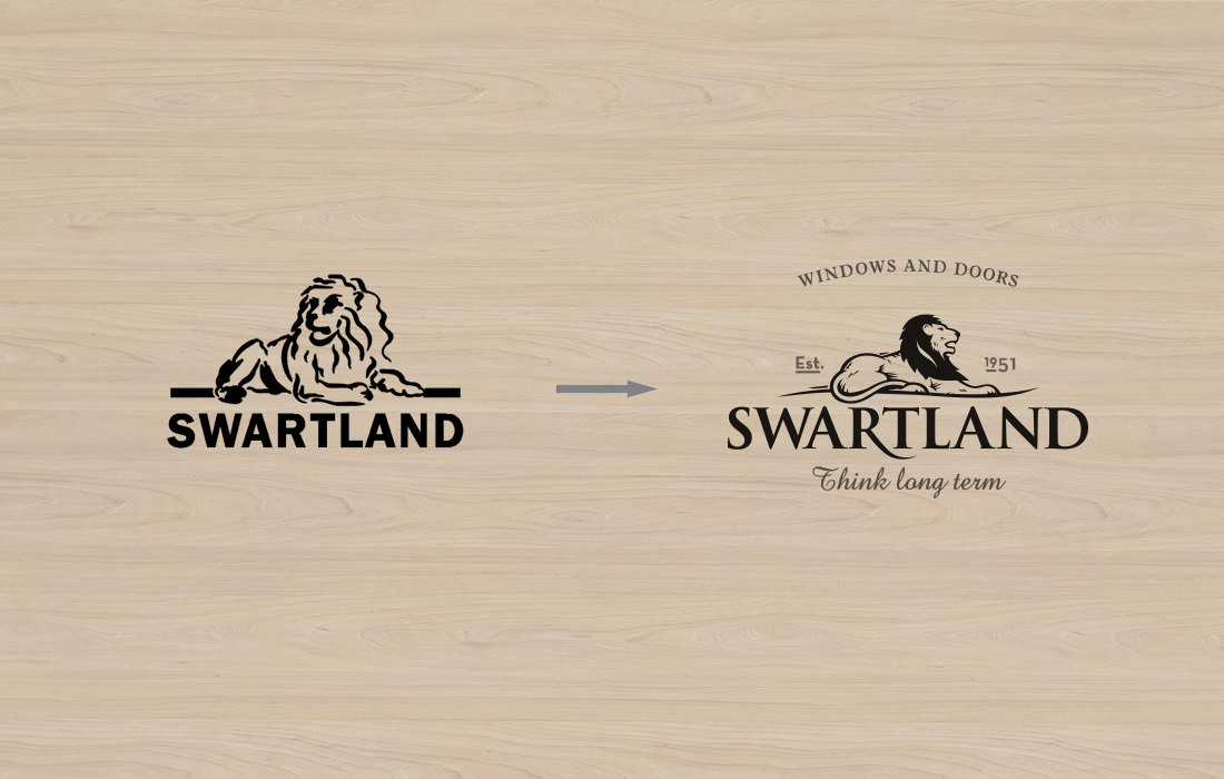
We were asked to update the corporate identity and re-position SA’s largest manufacturer of windows and doors.
Most brands in the robust building trade use loud colours and oneupmanship to get their customers’ attention.
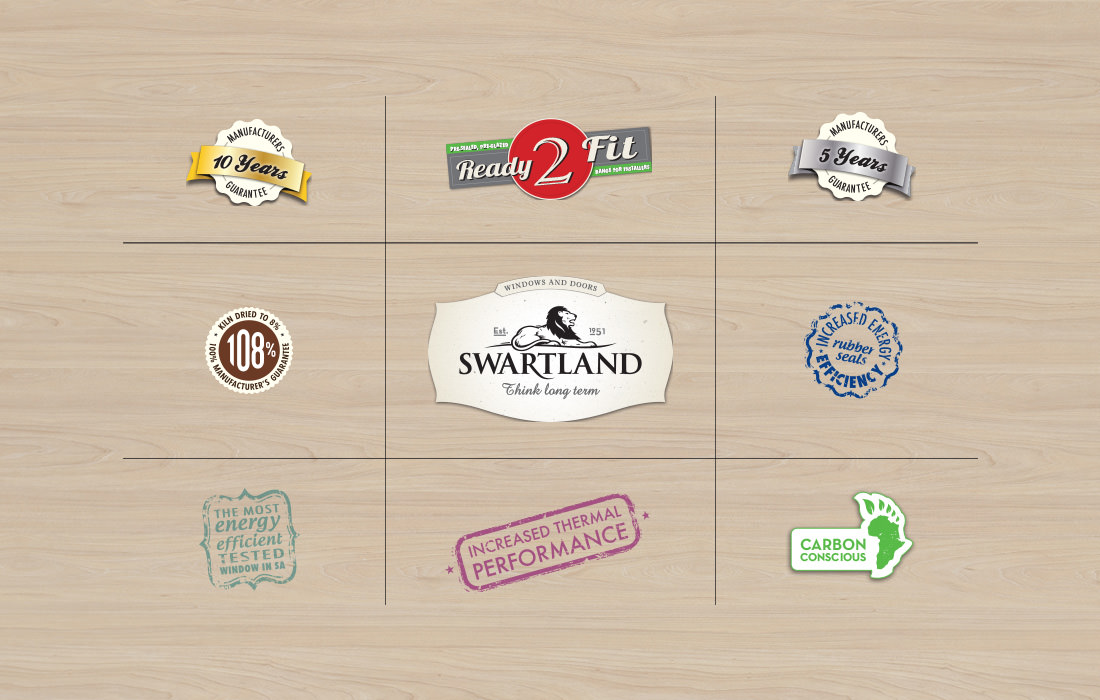
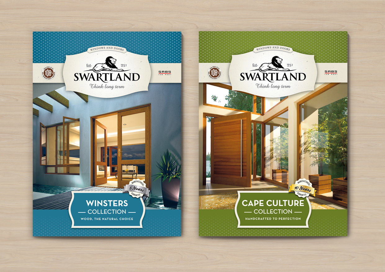
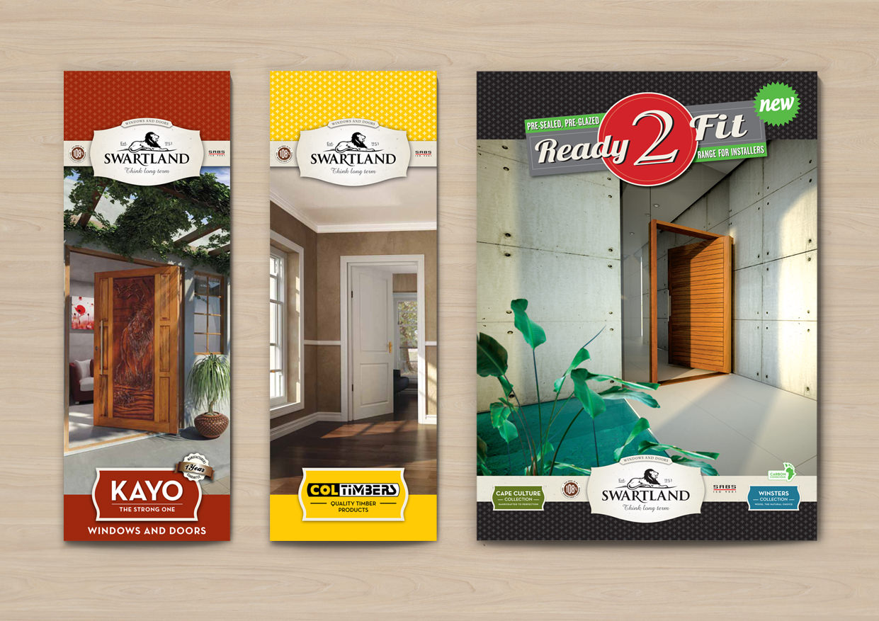
Our solution was a retro-chic design language, which transports our audience back to a time when values like craftsmanship and integrity were important. This not only helped Swartland stand out from the clutter, it also communicated the brands heritage and values.